Welcome to Finny's fashion blog...

Finny loves thrifting and the 2000s, check out what else is happening on the blog!

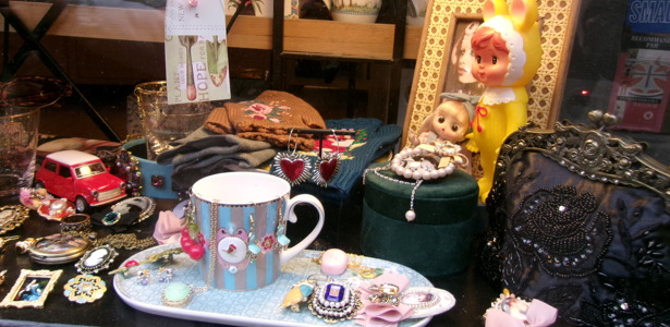
Thrift, thrift, thrift!

I buy new and on sale, but my one true love is second hand anything. I hope to only thrift in the coming years.

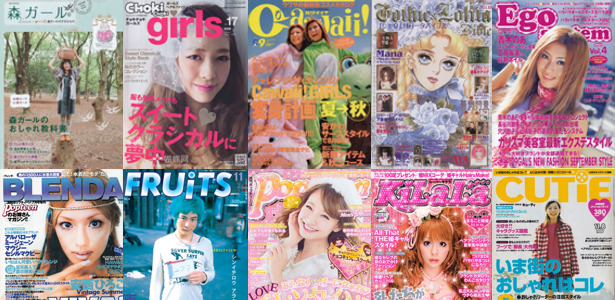
Magazines, fashion books, and catalogues.

One of my favourite fashion eras are the 2000s. You'll find a number of posts flipping through fashion mags.

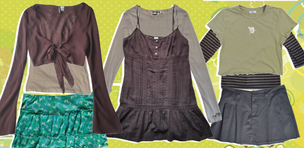
Dress up and accessorize.

Have a look at some of the outfits I have put together.

Closet showdown.

A comprehensive collection of my clothes, my jewelry, shoes, and more.

Monday, 24 August 2026

Hobonichi Preview #16: minä perhonen

So, the brand minä perhonen is one I've only heard of through Hobonichi. They are not Finnish actually (though the phrase directly translates to 'I am a butterfly') and create textiles. They are very expensive. Previous covers from the collabs with minä perhonen were between around 80 and 130 dollars/euros. I suppose if you really love the designs and quality this could be a reasonable investment but I find charging that much for a planner cover incredibly high.


The pattern of the A5/A6 blue cover is quite Nordic, but maybe because of the blue it feels a bit Mediterranean to me as well.  


The 'glass flower' A5/A6 cover has a zipper, and like a trifold, I actually quite like zipper-style covers. I think it keeps everything in one place very nicely and protects the paper. I'm not crazy about the actual cover design though. 


The 'piece' A6 cover (as the other 'piece' covers) is made from left over materials from clothing production. I love mixed textiles and patterns, especially when they have this kind of quilted or patchwork look, it's very comforting.


The 'piece' A5 cover might be my favourite, because of the darker yellow lining, it's quite fun to look at.


I think the blue pattern looks better on the more square-ish covers like the A6 or A5 but it works well on the weeks too. And the zipper is great.


Actually the best item is probably the 'piece' weeks. It has very pretty muted colours, a zipper, and very cute textiles. 


There is also a tote. It's an average cute yet tiny tote.

I believe a lot of the cost comes from the labour and materials (such as the cowhide inner lining) and that totally makes sense. I just could never justify a 100+ dollar cover but if someone sees this being their long term cover and the style appeals to them, it checks out. 

Hobonichi Preview #15: Leo Lionni

I've not been keeping up with the last week of the Hobonichi reveals, so I'm gonna be making some posts about the collections I've missed so far. This entry features two covers and a Weeks with art by Italian picture book author and illustrator Leo Lionni, specifically his mouse character, Frederick. I personally did not read or have any of his books as a kid but his style reminds me a bit of Kretk, an adorable Czech cartoon from my childhood. Specifically the background art.


Frederick collects the sun, as he is known to do, on the A6 cover. The mice on the inside with pieces of corn are especially cute. 


My favourite is probably the A5 cover. The grey mice and the bright colours are very pretty together.


The Weeks has a lovely red touch and I actually quite like the faint signature on the back and would have liked it on the front as well. 

Wednesday, 19 August 2026

Hobonichi Preview #14: V&A Series

A very intriguing collaboration between Hobonichi and the Victoria and Albert Museum in London. While the covers and notebooks are gorgeous I am a bit queasy on any western European museums that don't specialize in fine art and have collections full of objects from outside Europe. That's usually because countless artifacts in their collections are there because of European imperialism, looting, slavery, etc. The V&A Museum is no exception, though they have repatriated certain items (such as the Asante gold regalia that is originally from Ghana, though the museum is only loaning it back to Ghana now, which is wack) and they do provide information on the truth of how certain items were stolen though the machinations of British imperialism.

Okay, what the fuck does this have to do with Japanese planners? Nothing directly, I guess, just that this collaboration is with such a museum and for those who prefer not to support establishments that operate like this, this may be a skip irrelevant to the appearance of the collection. I think the collection is amazing but I'd be hesitant to support the V&A Museum. Apparently they also fired many workers during the pandemic instead of retaining them. Boo! Okay, I don't know what exactly I'm getting at here but I guess it's better to know than not.

Many of the featured covers and notebooks use the art of William Morris, who is not only a legendary textile designer, artist, craftsman, and poet but also a socialist and activist! He's a pretty cool guy and immensely skilled as an artist, most famous for his floral textiles. In fact, I had a notebook that I used between 2013 and 2014 that features his Honeysuckle wallpaper print. I was in love with that notebook.


The A6 cover uses the Strawberry Thief print, some adorable thrushes are busy stealing strawberries. The inside textile is also very pretty and I will give V&A a nod for their pleasant logo. The quote reads: "Have nothing in your houses that you do not know to be useful or believe to be beautiful."


The A5 cover's art is done by a friend of Morris, John Henry Dearle. The back has a different design, the Leicester (pronounced 'Lester', the British are hilarious) print. I actually like the different prints, I think if the spine was a yet another different print it would really bring it all together.


The HON is the star for sure, the canvas-coloured base of the cover with the print over it is gorgeous. And the dark spine really works!

I think my favourite is the Leicester and Wreath Weeks design. It's two great prints and I think the bottom strip in green is the best feature.


I think the Welcome to V&A Weeks is cute but not really for me.


The stationery is pretty great over all, each pen board is perfectly designed. I think if I had to pick a favourite it would be the A5 size. 


My favourite is as usual, the sticky notes. These ones are extra special. I love the colours, the design. I'm a little too tempted! Though I wish we could see all five designs.


Very cute stickers and it's pretty fun that they're nearly actual-size, though I don't think that would be very practical for me.

The tote is ugly! I hate houndstooth. 

What do you think about this collection? Am I placing a little too much weight on this collaboration or is it warranted (it is to me)? Overall, I think it's a very beautiful series of covers and stationery, mostly due to Morris' exceptional art.  

Tuesday, 18 August 2026

Hobonichi Preview #13: Alettone/Tragen

A very cute set of covers! Hurray! The past three lineups were not very exciting (due to my personal taste, of course!) so it's kinda fun to look at something I do like.


The Alettone cover comes in the A6/A5/Weeks sizes and has a lovely turquoise colour with a very cute print of some of the best sweet treats (melon soda, jello, donuts, etc.). PVC is not ideal and I imagine a time will come when it starts to fall apart. I guess the price is alright if they will be priced the same as models form the previous year (around 20-25 euros).


The Tragen in a misty plaid is probably my favourite of the two. Oh really, you say, the plaid is your favourite? Shocking! I know I'm really predictable but I can't help that plaid is a perfect pattern! I think it's also cool that it has a special pocket. In fact, both models have extra room for knick-knacks. However, if it's priced like previous models at 50 euros, it's way too expensive.

I think both models are very cute but I don't think I'd buy either.